Wrestling signs have always fascinated me. The premise itself is pretty genius. It’s a way of getting your opinion across without getting lost in the melange of cheers and boos from the crowd you cohabit a venue with. Speech can get lost in a crowd, but the visual of a sign with your thoughts on it, serious or otherwise, is a little easier to spot. Why be loud when you can be seen? As I became more interested in wrestling, I designed a lot of these signs to bring to shows to show my support, experiment with visual media and experiment with jokes and humour at the same time.I always fancied the idea of bringing a sign to a show. From the simple, straight-forward signs to the complex and often surreal ones, they always knew how to draw attention and bring an added layer of humour to wrestling shows. Granted, taking attention away from the performers might be seen as a bad thing, and with the more vulgar signs this goes without saying. In my experience, though, performers often get a kick out of seeing them. Often, it gives them some license to interact with the crowd. Whether the sign supports them or insults them, that layer of engagement can be very useful in developing a wrestler’s character and reputation with fans.
I designed my first sign a couple years ago ahead of a WCPW Show in Newcastle, Refuse to Lose. It was the second live, independent show I’d ever attended and it was safe to say that I was enamoured with the concept. My first designs were not complicated, but I did learn a lot about how to make an attention-grabbing sign.
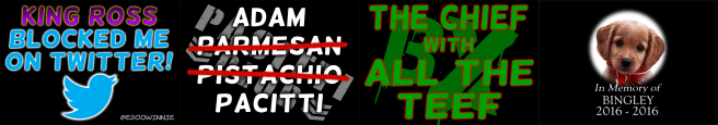
Initially I was happy with how these designs came out. I tried to incorporate as much design philosophy as I knew (Not Much) and as many Photoshop skills as I knew (Again, not much) and what came out was pretty impressive by my own standards. Unfortunately, I’d learn that what looks good on a computer screen, will not necessarily look good in the limited lighting of a sports arena. The purple on black of “King Ross” was almost illegible in the footage I re-watched. Likewise with the dark green and black in the 3rd sign. The only two signs that were even remotely readable was the 2nd and 4th sign, however even the second sign was just too busy to properly read at a distance. Again, looked great close-up, but suffered as soon as it went any distance away. The best sign of the night turned out to be Bingley, a dog who in the WhatCulture narrative would die of a broken heart if anyone had impure thoughts. Naturally, I brought it out during a SoCal Val promo which, if I remember correctly, did get a noticeable pop from the crowd members who saw it. (At least, that’s what I choose to believe.)
Observant fans will notice that I never made any signs for wrestlers, only for the YouTube Personalities that I was aware of. This is largely because, as I mentioned earlier, this was my second independent wrestling show. I still had very little knowledge of the wrestlers who frequented this promotion. As time went on and I learned more about the performers who were part of WCPW, I began to make signs aimed at wrestlers instead.
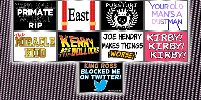
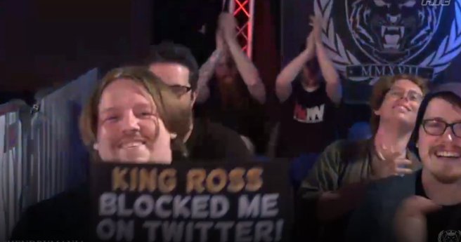
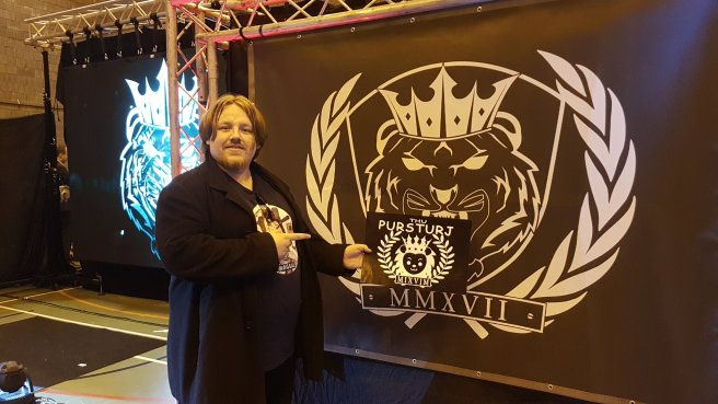
In May last year, a local show in Edinburgh, again with WCPW, prompted me to design these signs and, as you can see, more care was taken to ensure that signs were more readable at a distance. They are less cluttered, simplified and use more contrasting colours to aid in readability. The signs proved to be a lot more successful, particularly when rewatching the footage online. they were easier to read in the dark and garnered some favourable responses from wrestlers as well as other fans. (One wrestler even elbow-dropped my “Pursturj” sign during a dark segment!)
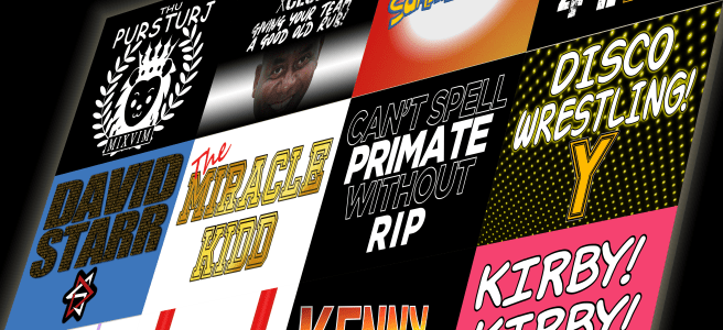
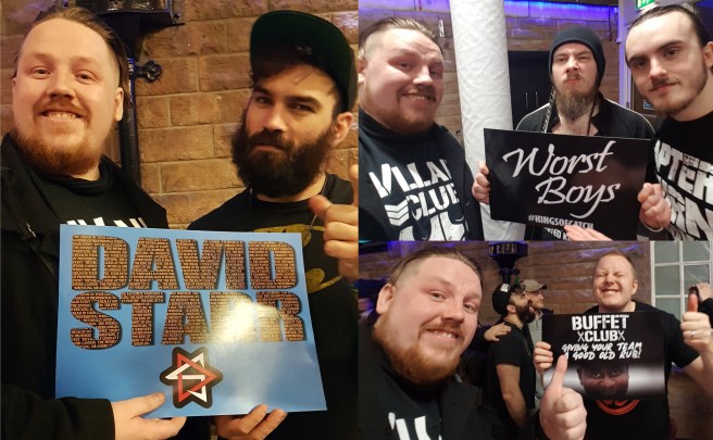
The last batch of signs I had designed were taken to a Discovery Wrestling Show in December last year. With a year’s experience of Photoshop under my belt, I tried to make these signs look as great as I possibly could.
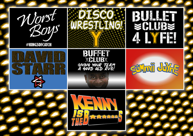
With the exception of the Disco Wrestling sign, which I confess could have been done a lot better, I felt proudest of all of these sign designs. I took a lot of care ensuring that all the elements of each sign were readable and high quality. I received a lot of positive feedback from the promotion, fans and also the performers themselves, some of whom even signed and posed with my signs after the show.
Since then, I have designed the occasional sign but haven’t really taken the time to print more. The shows I attend are usually local and fairly low-key so I don’t feel it necessary to bring a sign. On top of this, I’m usually situated in the general admission seats so signs are less visible and usually not as viable to bring along, especially if they are less likely to see it from where I’m seated/standing. While I occasionally design signs and make them available for general use, I find myself doing it less and less purely because, at the end of the day, the signs are not the most accessible thing for fans.
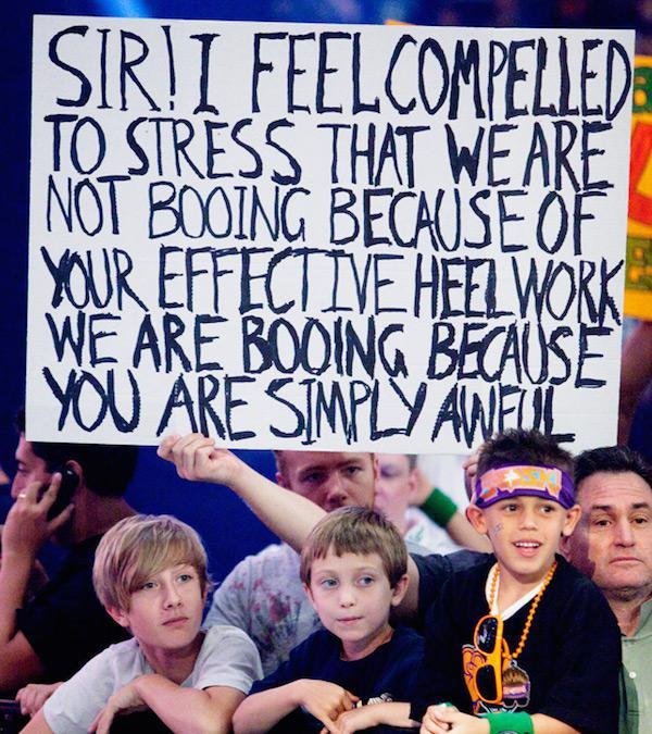
The beauty of a wrestling sign is more in its simplicity. A sheet of card and a marker pen. Your thoughts and feelings in bold, black ink held above your head in a crowd. As ridiculous as the verbose sign was, it was personal. It was their sign to hold up. My signs are exactly that: my sign. It’s my opinion and my joke. Printing them is quite a process and, in my case for how I printed them, quite expensive. I’d be more than happy if anyone used my designs at a show, but it’s understandable that not many people do. I see these signs more as a challenge for me to design something that epitomizes the performer and can be understood as easily as sharpie on a piece of white paper.
It’s weird to think that all of these designs were made over the course of a year, that’s not including some of the one-offs and other designs that I didn’t get a chance to show off. There’s a definite progression in my technique and skill that I hadn’t really noticed until right this second. It’s important to look back on these things and give yourself some perspective. Granted, it’s not earned me that lucrative merchandising deal yet, but to receive any compliments on my work is a start no matter how small. Perhaps it’s better to take solace in knowing that I made someone smile along the way, even a little bit.
Hell, even if I made myself laugh, that should count for something, right?

One thought on “Give Me a Sign!”