One of the joys of learning about Photoshop and photo editing is being able to make edits like the one above. The one thing I try to do, when doing edits, is making things as clean as possible and as true to the real version as I can. Sometimes this is easy and sometimes this is hard. A lot of it comes down to the level of detail required when replicating something. With logos, especially the one above, it comes down to how easily can it be replicated and how much needs to be there to be a readable, believable replication. Last week, I spent a lot of time working with the WWE SummerSlam logo and I thought I’d run through the process of copying and replicating this iconic logo.First thing you’ll need is the original. A high resolution, recent version of the original logo. A quick google search is usually all you’ll need here. Ideally, a transparent PNG allows for the best quality and avoids things like artifacting that jpegs often have at lower bit resolutions.
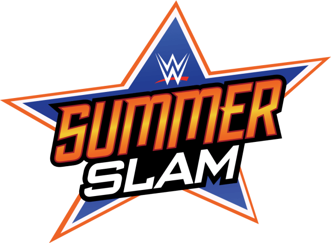
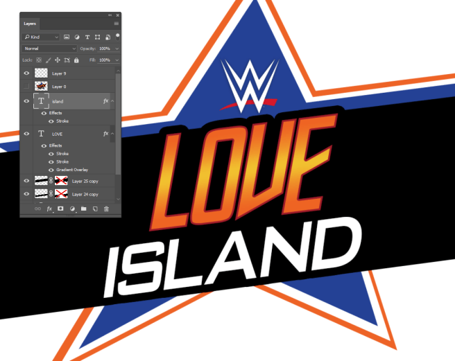
The next step is making an editable copy of the logo, specifically one that can be exploited with any text you want. The best way I found was to use Photoshop’s pen tool and trace out the design’s 3 layered star. This requires some predictions since certain points of the star are obscured by the text. However, since a star’s points converge on straight lines, it’s a fairly easy prediction as to where the hidden lines meet.
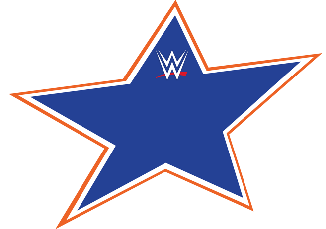
It’s important to note that, as these lines will usually be hidden by text anyway, detail and consistency may not be that important. However it might be worth the extra work depending on how you intend to use it. Blocking in gaps with color could also work but may add additional work in the long-term should you make more than one edit.
Also, it’s important to note that the WWE Logo is an svg vector accquired online. SVGs are vector graphics that are stored like webpages but can be opened and sized to any dimension you may need. They are extremely useful if you need logos for designs both big and small. You’ll find a lot of logos, like YouTube and Twitter, stored to this standard on various sites online.
Moving on, we need to worry about the text itself. Fonts can often be found online through font forums. I was lucky to find a discussion about this font and found the two closest fonts used were FederationClassic for the “Summer” and BankGothic for the “Slam”. Forums are usually good at identifying fonts but you’ll often find that the fonts identified are “Close enough” to the original. You’ll probably have to add to your designs the finishing touches to give it the same look as the original but “Close Enough” may have to do a lot of times. Most designs will use proprietary fonts or will have text designed at the time so copies are not so easy to make.
The next thing you need to do is add the effects to the text. You’ll need to add a slant to match the original, ensuring that both text lines are parallel to each other, easily done through the transform tools. Next, adding the effects to the text itself, you’ll need to add a red, inside stroke to “Summer” as well as a gradient overlay to match the original’s orange/yellow fade. To finish this step, add another large black outside stroke to both text lines to add the black backdrop to the text.
Finally, you need to block out the gaps in the text. Now, in the example above, using the paintbrush tool on a layer behind the text will do but, with certain text lines, there may be gaps that need to be filled in with blocks of colour. You can either block it in with the polygonal selection tool or the Pen Tool or, if you plan on making a bunch of these, you can do what I did and make a block of colour that runs behind the text and use the vector masking tools to block out the relevant areas while keeping it reusable for future projects.
So, what did I learn from this endeavour? Well, I learned that editing can be made more efficient by taking a little more time ahead of the project. During the SummerSlam period, I produced just under 90 different versions of this one logo. When I started making them, it usually took a good 5-10 minutes to produce one of these but, once the process was streamlined, I was producing them in a couple of minutes. Was it dumb? Was it overdone? Well, yeah. However, being able to analyze one’s technique during a project is important and you should always take time to understand if you can do something faster and simpler rather than spend too much time on the same thing.
It’s not whether it can be done fast or done well, it’s about bringing the singularity closer together with trial, error and evaluation.
Now to conclude, here’s a bunch of my favourite edits done over SummerSlam.
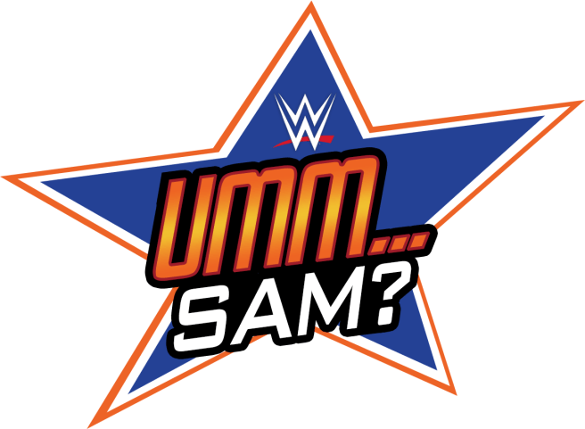
Every post was preceded with a tweet saying “Hope everyone’s ready for…” as if to build hype for SummerSlam but bait and switch when they see what the logo actually says. Initially, I wanted to do anagrams or just subtractions from the original logo. Kinda ran out of steam after, like, one… So I just began using random things that rhymed with SummerSlam instead.


One kind of led to the other. I was kind of running out of good ideas after a few of these but a follower mentioned how funny she was finding this and I figured “Fuck it, let’s go all out on this!”
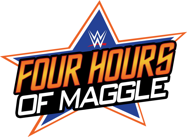
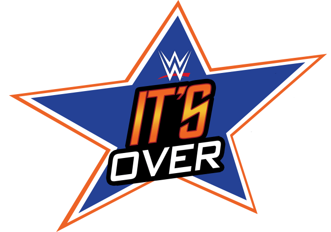
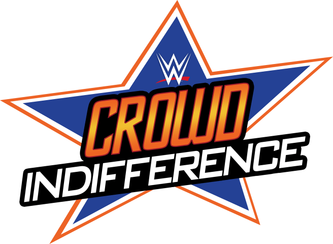
I eventually turned the logos into general SummerSlam complaints. This version making reference to somewhat polarising commentator Michael Cole, nicknamed “Maggle,” by former co-presenter JBL, who often presents these shows much to the ire of some fans.


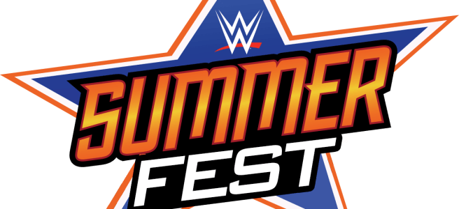
Next was using other PPV titles in the stead of SummerSlam. Some of the shorter ones made me glad I had made the exploitable logo. Saved a lot of time in the later edits.


During SummerSlam, I used the signs to essentially commentate on key events during the match. Those who watched SummerSlam will probably remember these moments as they happened, I was trying to respond to them as quickly as I possibly could.
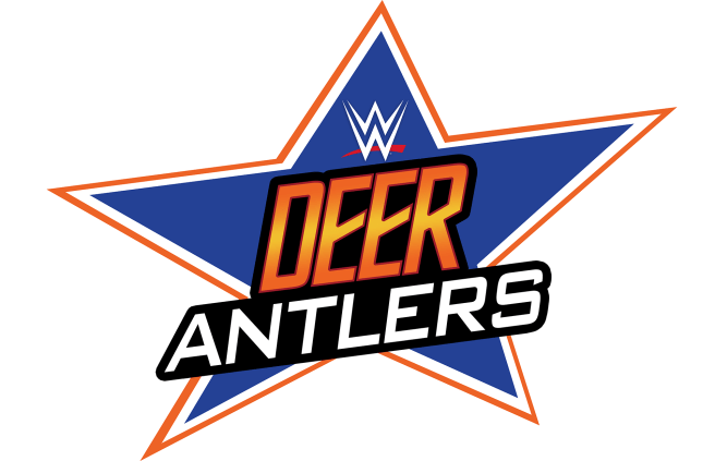
Of all the logos, this surprisingly became the most popular. I posted it after a wrestler appeared wearing deer antlers as part of his entrance gear and I thought it warranted a mention. A friend of mine retweeted it and it got the most retweets of the night by far. Apparently, I accidentally made a Twin Peaks reference and he’s a big fan so… yeah. I’ll take it.
Sadly, or not depending on your perspective, I had pre-designed a few signs to post through the night that were a little pessimistic. Given the show’s actually entertaining performance, I didn’t need to post this image thankfully. I had lower hopes for the Roman vs Brock match, it could be said.
Again, Roman vs Brock. I just liked this one so I’m posting it.
You can find all of these on my Twitter page between August 17th and August 19th but I’ll leave a link here to the search dialog that’ll take you to all of them, hopefully. Good thing about tweets that are all laid out the same way.